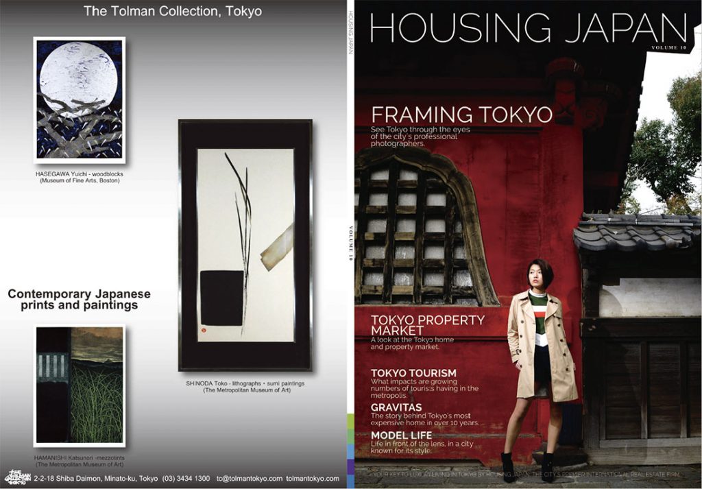
Towards the end of 2015, I was asked by a Tokyo real-estate company I was shooting for to get involved and design the next issue of their magazine. It’s been a journey of a few months, but at the beginning of April 2016 the first magazine was released and everyone’s happy with it.
UPDATE: In late April of 2017, Volume 11 of the magazine was finished and again it was a great experience. You can see that magazine online here.
Prior to taking on the job of re-designing Housing Japan’s magazine, I’d made dozens of e-magazines and worked on components of the print magazine design process. So I knew how everything worked but hadn’t ever done it all myself.
There were some fairly targeted goals for the new mag, foremost of which was making it look more ‘editorial’ and less like a promotional publication. There’d been one key distribution location for the previous magazine where they’d felt it looked ‘too much like a catalogue’ to want to have it on display. Having them accept the re-designed magazine into their establishment gave me a huge sense of satisfaction.
Incorporating Housing Japan’s corporate colours into the magazine in a new way was something I wanted to do first. The multi-coloured swatch of purple, two shades of both blue and green is a nice palette to work with and my first thought was back to the Realworld music label created by Peter Gabriel, with whom I’d worked a lot during my time in the music business. Realworld releases were always very easy to spot on the shelves of the music store, even if you only had every piece of product displayed spine-on. The Realworld ‘colour bar’ was something that had always struck me as a great piece of very simple branding.
So the spine of the HJ magazine has a colour bar just like it. Thanks, Peter Gabriel and Realworld for the inspiration.
Next I went through a few font auditions. I like fonts. I’m a bit of a type geek.
We ended up with Lato for body text and the rest of the family was Raleway, Montserrat, Minion Pro and Varela Rounded.
For the features inside the magazine we had a long list of possible topics, subjects and people in our sights. That got paired down and modified over time but we still ended up with a nice blend of lifestyle, food, fashion and travel. Over the past two years I have shot for a lot of inflight magazine clients. They tend to ask for a lot of pictures, to cover a massive swathe of subjects around their core focus. Those shoots had left me with a lot of awesome material that they’d never used. Some of that has finally, now, made it out into the light inside of the Housing Japan magazine. There’s lots more left to publish, too… which is great.
To keep the production process as streamlined as possible for the first issue, it transpired that most of the photography inside was mine.
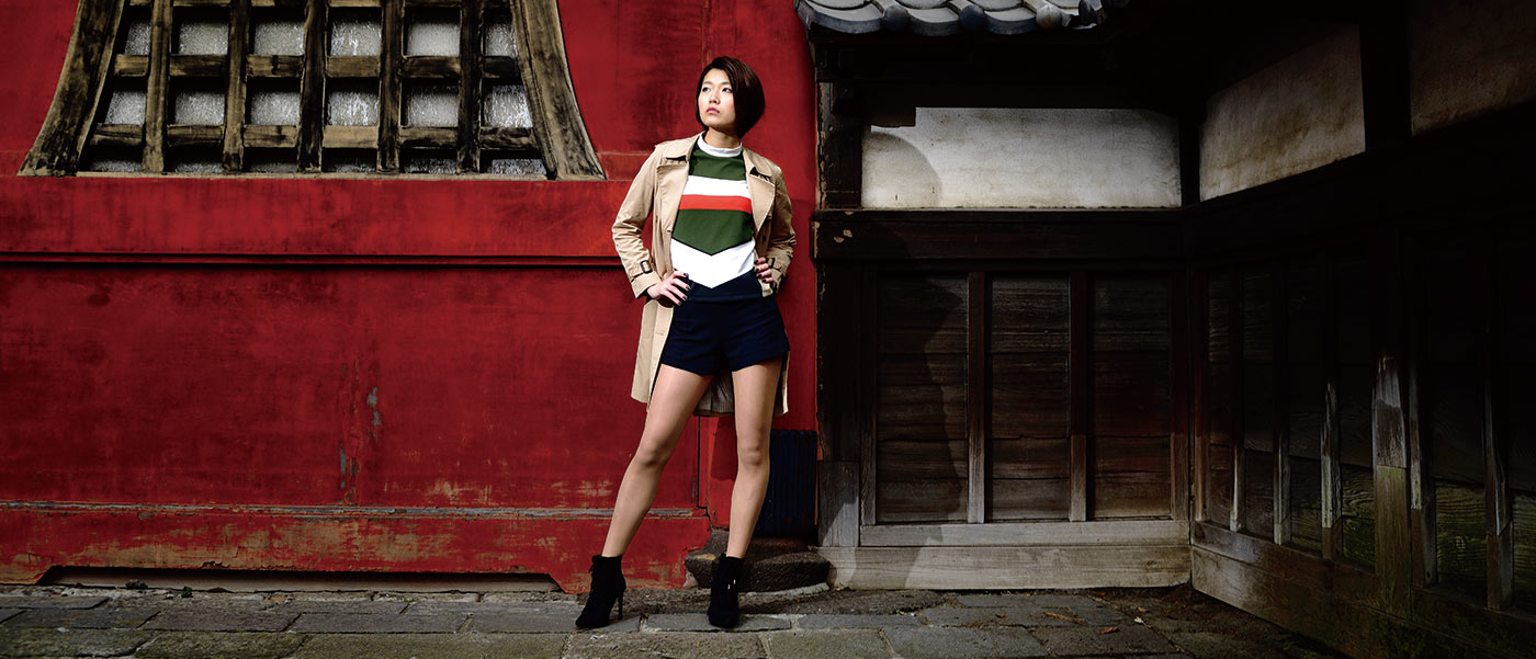
As well as items from my back-catalgoue, we shot some new material too: the feature on Norie is one that incorporates new shots and some from before. The cover was a new one, the first shot of a shoot that we did across Zojoji and Roppongi in three hours one recent morning.
The cover shot was very simple: Nikon D800E, Nikkor 36-72mm E series manual lens, one SB-800 flash on a monopod and shot through a 20degree grid.
The red there at Zojoji’s front gate is awesome. The top that Norie wore was chosen especially for this shot, adding a nice swatch of complimentary colours.
So that’s it really. Less writing, more chance for you to see the magazine for yourself.
At the foot of this page there’s an embed of it at Issuu.com. You can flip through it here or click to go direct to the Housing Japan magazine on Issuu.com
I’d like to take this last section to thank some key people:
Hashimoto-san at Housing Japan for commissioning me to do the work.
Adam German at the company, for taking a quick conversation outside over coffee and turning it into a commitment, for his support throughout the production process and for writing some of the key articles.
Robin Sakai at Housing Japan was my partner for the whole process, including helping out on the shoots we did. Robin’s been tireless in assisting me turn this magazine around and keeping me focused on all the key points.
Thanks to Ben Torode for letting us use two or three of his awesome aerial shots of Tokyo.
Thanks to Norie for the shoot and for being our cover girl.
Thanks to all of our advertisers.
Thanks to all of you who have picked up the magazine and read it so far.
I’m looking forward to making the next one!


